
Anyone who sells a product wants to expand sooner or later. A new flavour, another size, a sugar-free variant. That is good news, but it puts pressure on the packaging. Every new variant gets its own colour and its own image. Before you know it, there are five tubs on the shelf that no longer seem to belong together.
A label system prevents that. It sets out what always stays the same and what may change per variant. I show it through two projects: Can’t Unsolve, an own brand, and Bottld, a concept.
What is fixed and what is free
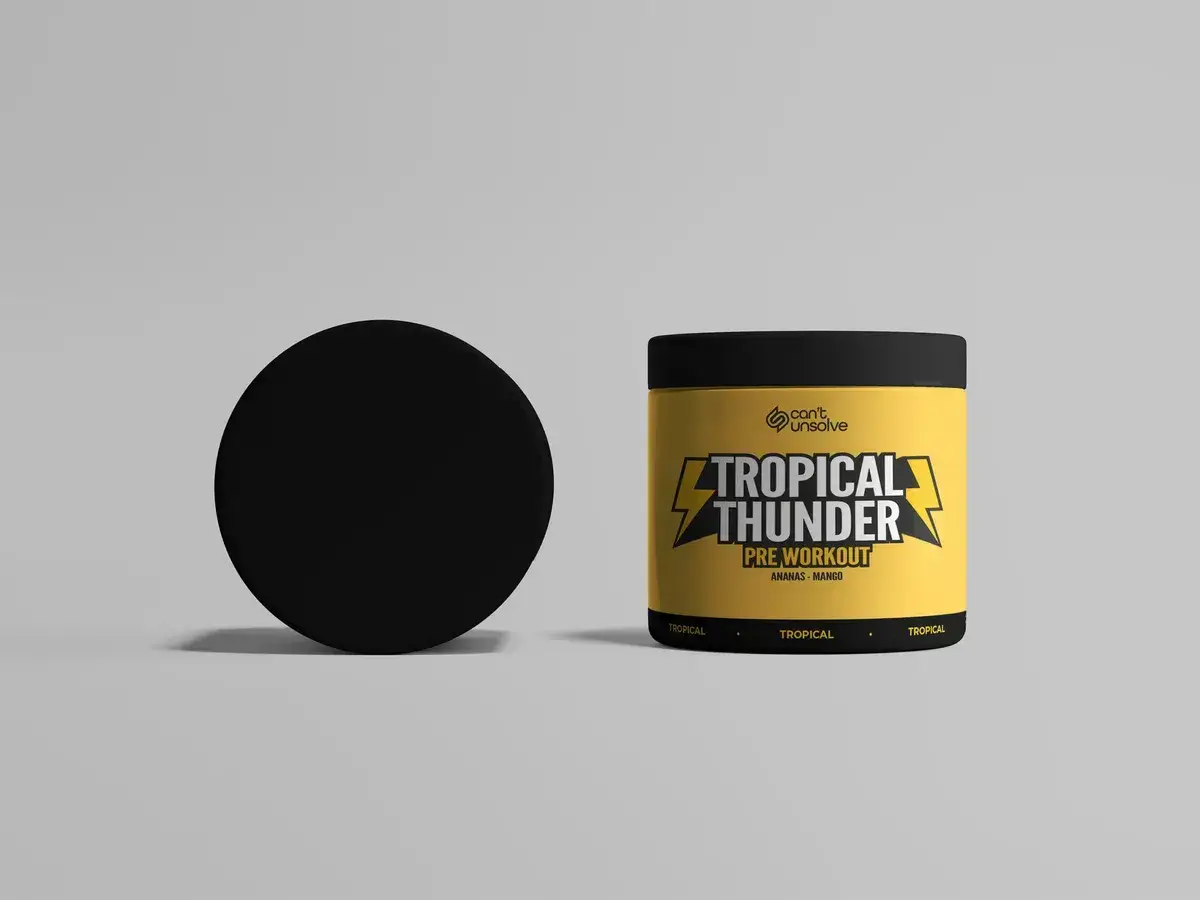
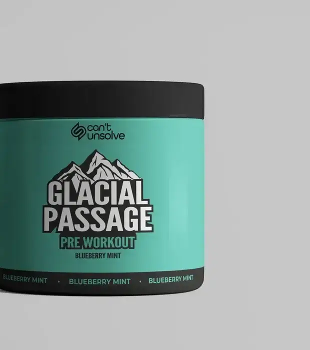
For Can’t Unsolve, a pre-workout in two flavours, the order is fixed. The logo sits at the top, the flavour name in the centre and a flavour band runs along the bottom. That layout is the same on every tub.
What is free is the world of the flavour. Glacial Passage is cool and blue, with blueberry and mint. Tropical Thunder is warm and bright, with pineapple and mango. On the shelf you read them as one line, yet each tub has its own character.
Less is a system too
Bottld is a concept for a protein shake in three flavours. The question I asked myself: how little does packaging need to be recognisable? The answer became a wordmark of block letters falling vertically down the bottle, with exactly one colour accent per flavour.
Nothing else changes. A new flavour is a new colour. That makes the system strict, but also very easy to extend.
How I build a label system
- Fixed places. Logo, product name, variant and the required information each get a fixed place on the label.
- One thing that varies. A colour, an illustration or an image per variant. Not all three at once.
- One grid for every size. A label for a 300 gram tub also has to work on a pouch or a sample.
- Room for the third variant. I always design one variant more than needed now, to test whether the system holds.
From label to webshop
A good label system works online too. With 3D visuals of the packaging you can show a product before anything is printed. In a webshop the variants then sit neatly side by side, in the same line as on the shelf.
Both projects are in the work: Can’t Unsolve and Bottld. If you are working on a product line yourself, have a look at packaging design.