


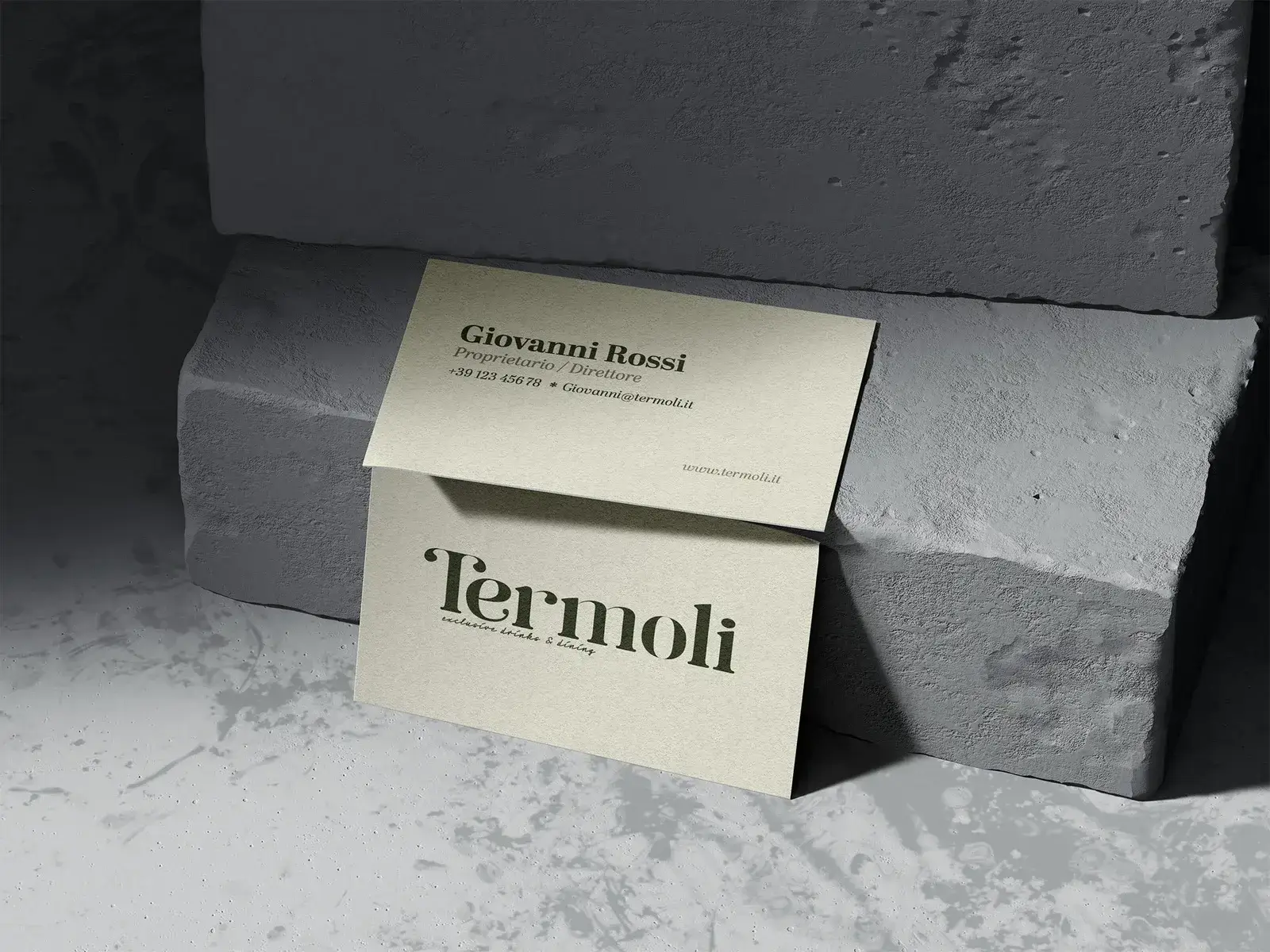
A brand does not end on the screen. You hold a business card, a label or a thank-you card in a delivery in your hand. Then it is not only what you see that counts, but also what you feel. That is why I choose the paper and printing technique with every brand identity.
It does not have to be expensive. What matters is that the choice fits the brand and the budget. Below are the three routes I suggest most often.
Digital print: fast and affordable
Digital print works like a very good printer. No printing plates are needed, so small runs are affordable and ready quickly. For a first batch of business cards, a test run of a label or print that changes often, this is usually the logical choice.
Digital print still gives you options. An uncoated 350 gsm paper feels very different from the standard glossy card. That difference costs little and gets noticed.
Offset: for larger runs
With offset, printing plates are made. That costs money up front, but the price per copy drops as the run grows. The colour is also the same on every copy, and you can work with fixed spot colours. For packaging and labels in larger numbers, offset is often the logical next step.
Gmund and other fine papers: a brand you can feel
Gmund is a German paper mill that makes paper with its own texture, colour and weight. Heavy, sometimes coloured all the way through, sometimes with a clearly tangible texture. It costs more, and that is how it should be. It is meant for moments when a first impression counts.
Techniques such as blind embossing, foil stamping and debossing come into their own on paper like that. A wordmark you can feel with your fingers is easier to remember.
How I make the choice
I start with two questions: what does the print need to do, and how often does it change? A card you hand over at a first meeting asks for something different than a label on a thousand tubs. Then I put two or three options side by side, with the differences in feel and in cost.
Before a run goes out, you see a proof. On screen a colour sometimes looks exactly right, on paper it turns out slightly different. A proof prevents you from finding that out when the box is full.
In short
- Digital print for small runs and print that changes often.
- Offset for larger runs and fixed colours.
- Fine paper such as Gmund for print that has to make an impression.
- Always a proof before the run.
More about how I build a brand identity at brand identity design.